In Color Theory Part I we introduced some basic color terminology and the color wheel. Now the fun part, color relationships. This article introduces some basic concepts in how to combine colors for knitters (and non-knitters too!).
You can find Part I over here.
Usually, the knitter plays with color through yarn choice. Unlike a painter, who blends pigments together to make new colors, or a digital artist who selects from a palette of millions, the knitter chooses colors from a pre-defined yarn palette and create relationships by placement and proportion of color. There are some exceptions: you can dye or over dye your yarn. You can hold multiple strands together, making the illusion of a new blend. And Lorraine Smith shows us the excercise of using “primary” fibers dyed cyan, magenta, yellow and black, carded together to create a new color.
Color relationships (sometimes called interactions or contrasts) are both scientific and mystical. You can study the wavelengths of two hues, the way they are received by the eye and interpreted by the brain. On the other hand, you can look at a color combination and react emotionally or instinctively, knowing or feeling that something is cheerful, comforting, gloomy, or even nauseating. That's the power of color.
Combining colors can be an infinite exercise. (Josef Albers anyone?) But knitting is time-consuming, so we prefer to experiment with winning relationships.
You can arrange your yarn colors in skein form, but don't forget that the effect of color relationships has a lot to do with proportion and placement, so swatch your color combinations too.
Beautiful combinations to try in knitting
Here are some basic relationships to get us started. I'm using pure hues here to best demonstrate the concepts, but don't worry, you can use these same concepts with neutral shades and tints too. Stay tuned for more on neutrals in Color Theory Basics: Part III.
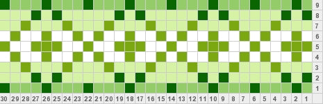
Monochromatic
A monochromatic color scheme (like the one at the top of the page) uses one hue. This may sound boring, but can yield the most elegant combinations. A monochromatic scheme can include tints and shades of a color. In knitting, you can play with adding small pops of contrasting color to a monochromatic scheme for high impact. For example, try adding a saturated lime green or warm gold to a neutral scheme in shades of grey.
Analogous
 An analogous color scheme uses colors that lie next to each other on the colour wheel. Since they share color properties, they are guaranteed to get along. Analogous schemes are low contrast and rich.
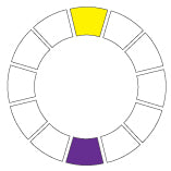
Complementary
 These colors lie opposite each other on the color wheel. Complementary combinations can be quite striking. If you use undiluted pure hues, complementary combinations are generally quite cheerful. If you use complementary tints, the result is easy and pleasing. (Think of Easter eggs: pale yellow and mauve; pale peach and blue; mint and pink). But be careful, colors that are not directly opposite each other can create jarring optical effects.
Split complementary
 A split complementary is similar to complementary, but one color is combined, not with its direct opposite, but the colors that lie on either side of its opposite. This combination is quite complex when you start adding tints and shades, and can yield sophisticated palettes.
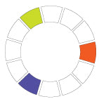
Triad
 A triad scheme uses three colors equidistant from each other on the color wheel. Like complementary schemes, triads tend to be quite cheerful and pleasing when using pure hues or tints.